Part Two: Before/Afters
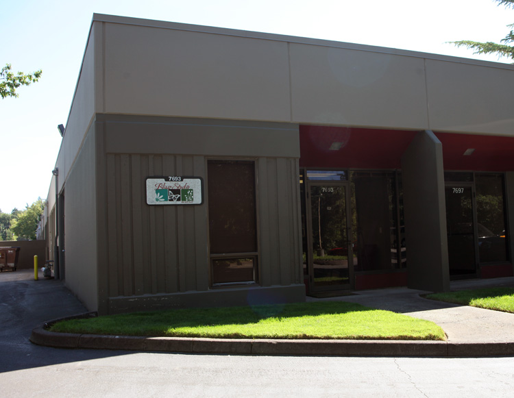
I wanted to continue on yesterdays post with a couple more shots around the studio building. You remember this photo? Just a plain shot of the outside of the studio building.

But this time lets take a look at the wall on the left AND the dumpster way in the back...
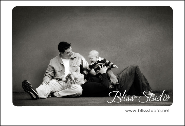
That wall used to be painted cream and I was in heaven. Then the management company painted it this what I thought at the time "icky color". I was really upset. But instead of letting it get to me I decided...I will MAKE it work. And that is just what I have done! Here is a couple shots taken right in front of that wall...


 A little lighting, a little texture and some beautiful subjects and my not so great wall becomes a masterpiece :)
Next we have the dumpster. Seriously. Okay...who really seeks out a dumpster? Ill admit I have used some fun ones that had graffiti on them for senior sessions. But I just wanted to prove this ugly dumpster could indeed be used in a shot. Thanks to Katie for braving it for me so I could get a shot!
 What do you guys think? Still enjoying? I have a Part Three is you are still interested?
Stay tuned...
~Whitney

